Translate the ArtAuction dedicated app into a Responsive website that can be easily navigated using various sized devices.
The Product
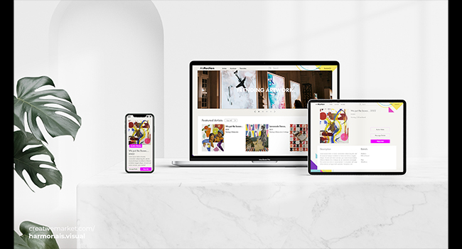
Art Auction Website is a auction service for art enthusiasts to find and discover artwork in a no hassle digital auction setting. It has been streamlined to be equally approachable for both experts and novice collectors. This is a continuation of a previous app design that was restructured for a responsive web layout.
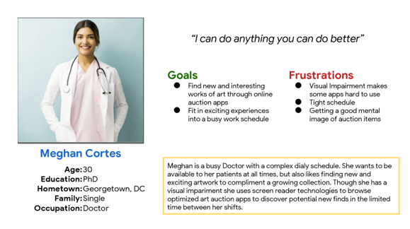
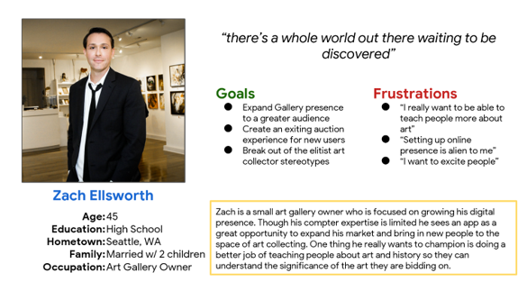
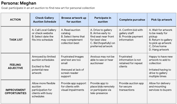
Remember these Users?
User research
I conducted interviews and created empathy maps to understand users who could benefit from an art auction app. One user group that was identified were individuals with busy schedules or who worked off hours and were unable to participate in regular auctions.
I also noticed a need for support for users with visual impairments as they may be less able to understand the images on screen if displayed at a small scale. This could limit their ability to participate as they would have difficulty visualizing the artwork up for auction
Pain Points
Individuals with tight schedules may not be able to partipate in their preferred auctions as they cannot shift their working hours accordingly.
Users with visual impairments may not be able to properly read the auction catalogue as the images may be too small for them to see
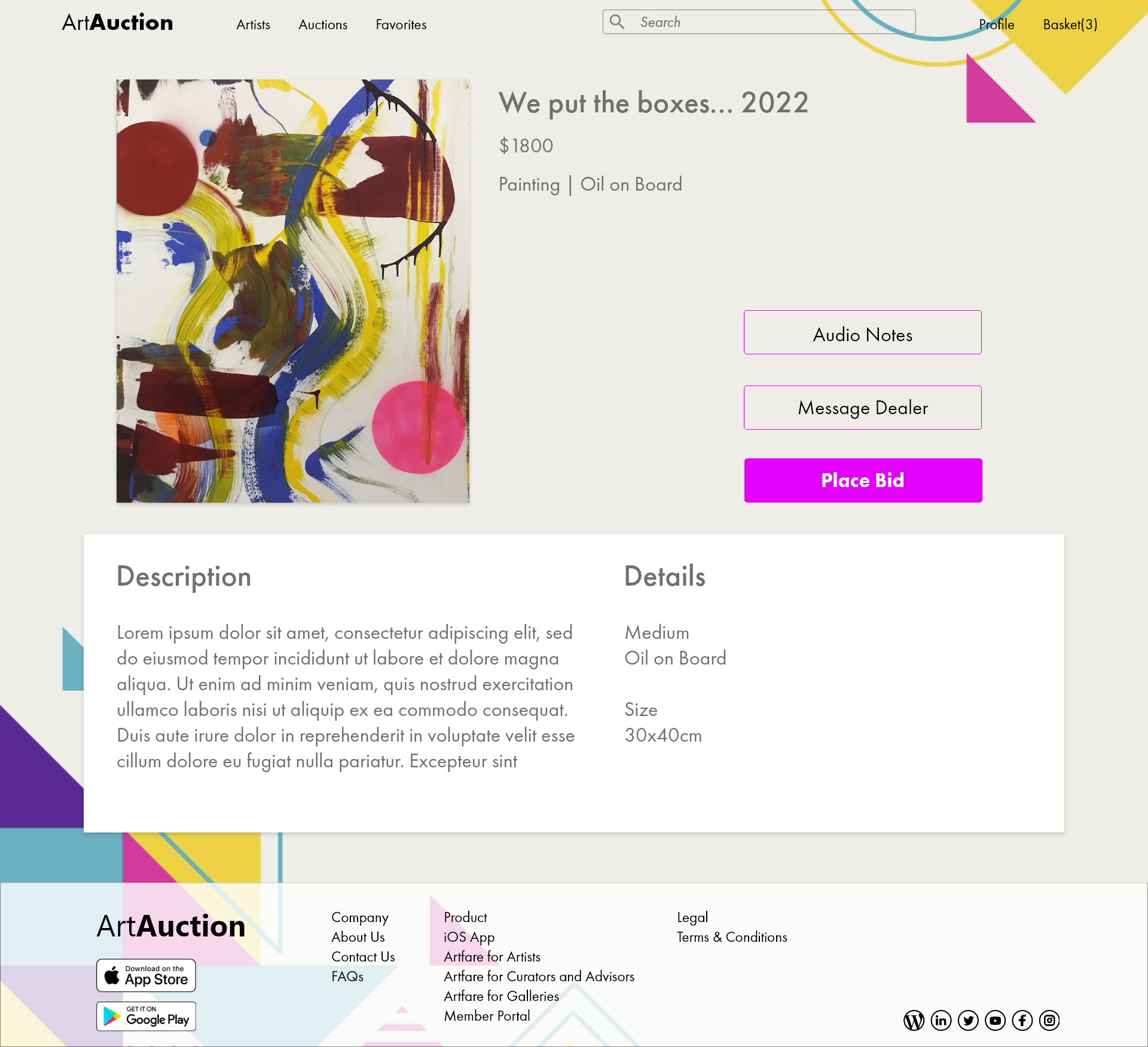
Gallery Owners may be interetsed in teaching clients more histroical significance about the artwork. It would be a good opportunity to give the catalogue more detailed artwork descriptions
User journey map
Mapping Meghan’s user journey informed areas for improvement and support to clients with tight schedules. It also showed possibile instances where additional care can be taken to design for clients with visual impariments
Concept Development
Wireframes
UI Overview
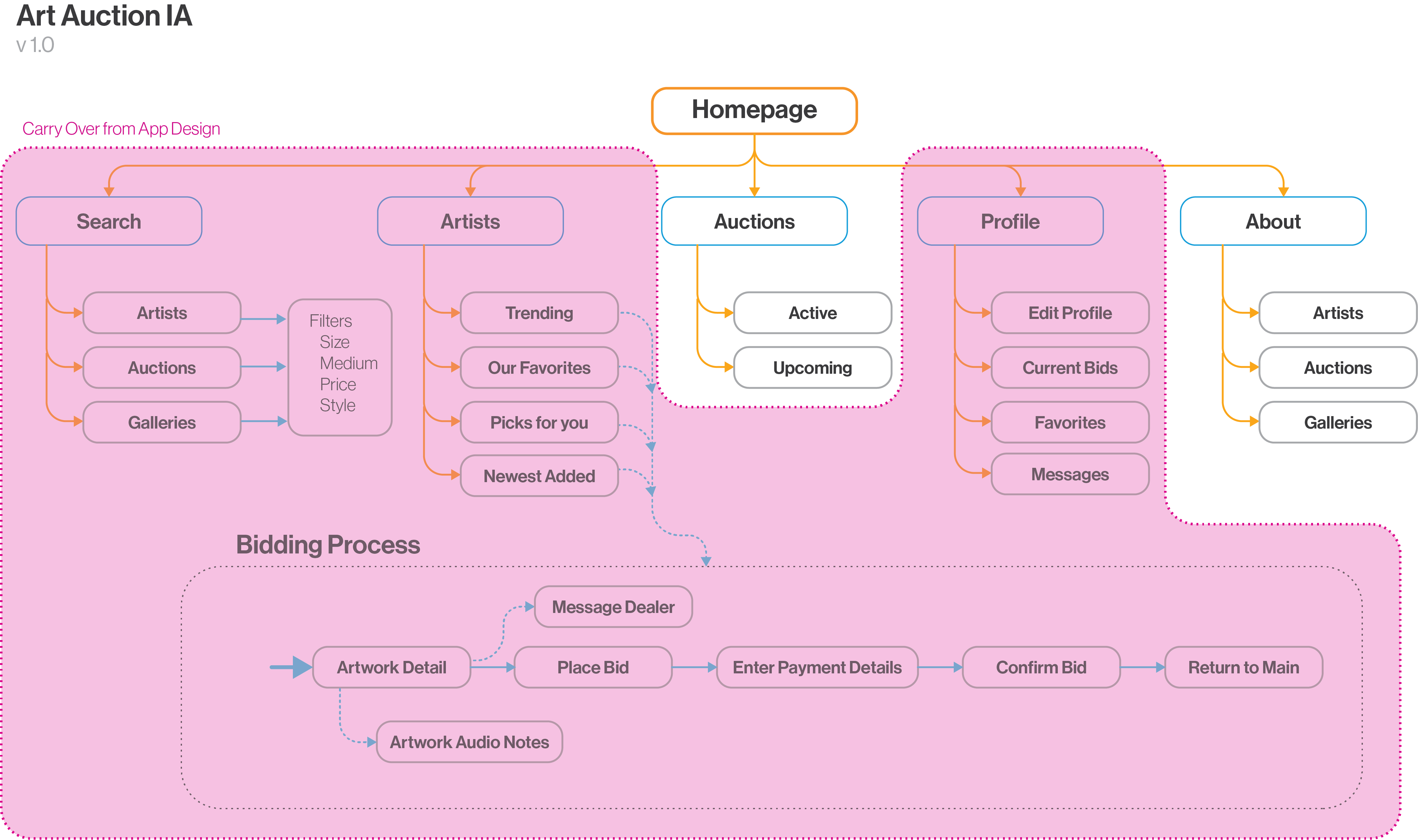
IA & Wireflow
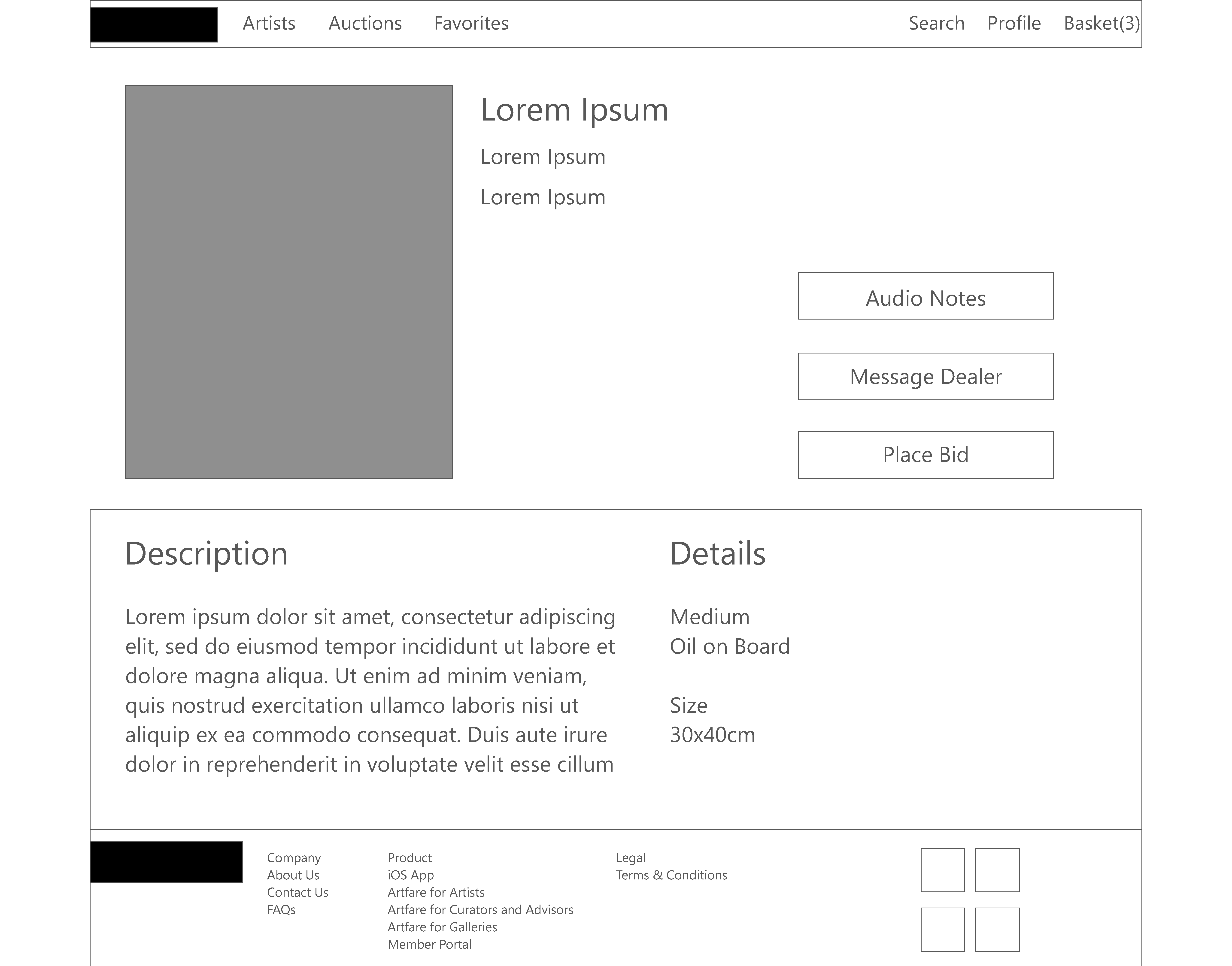
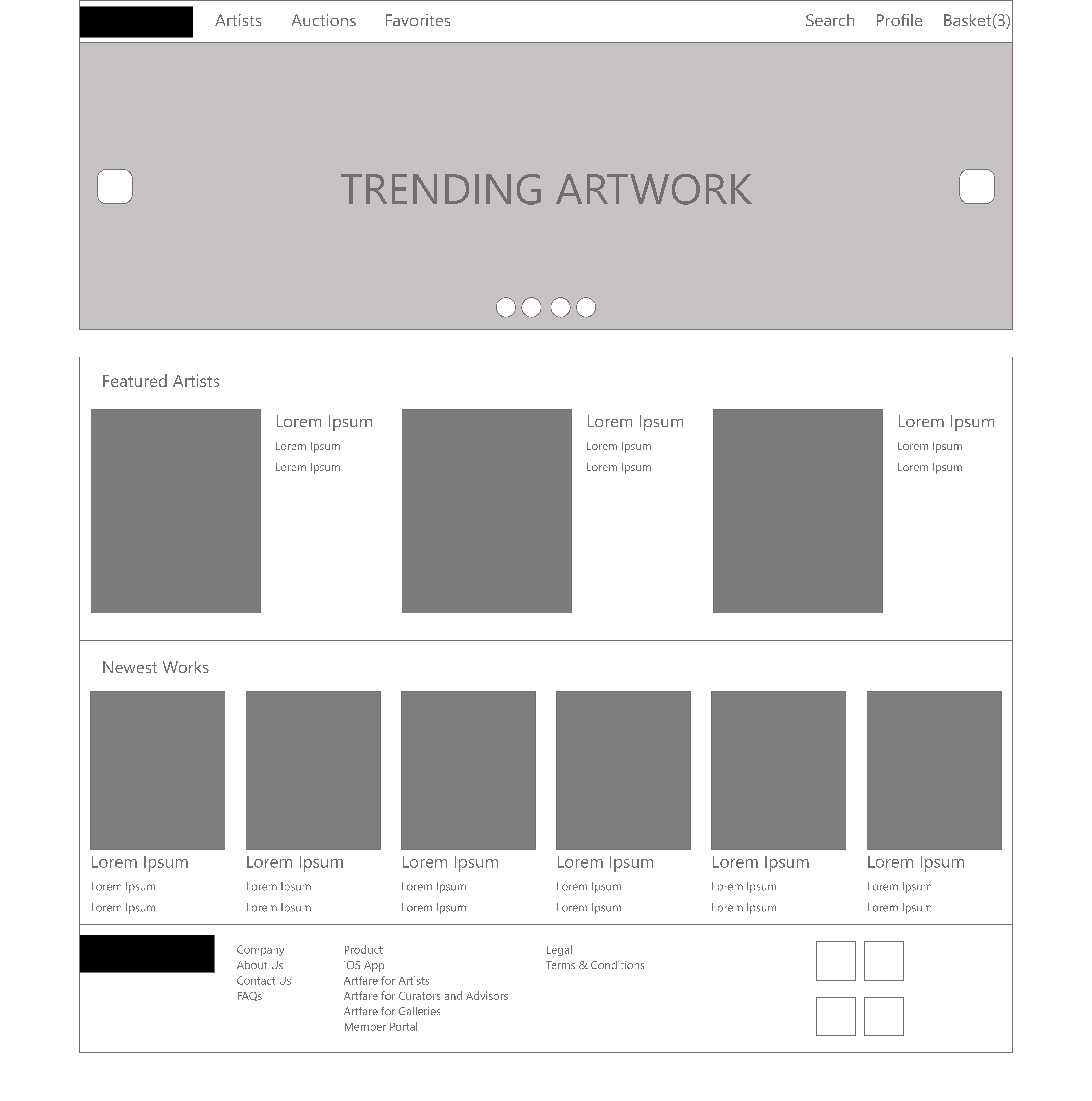
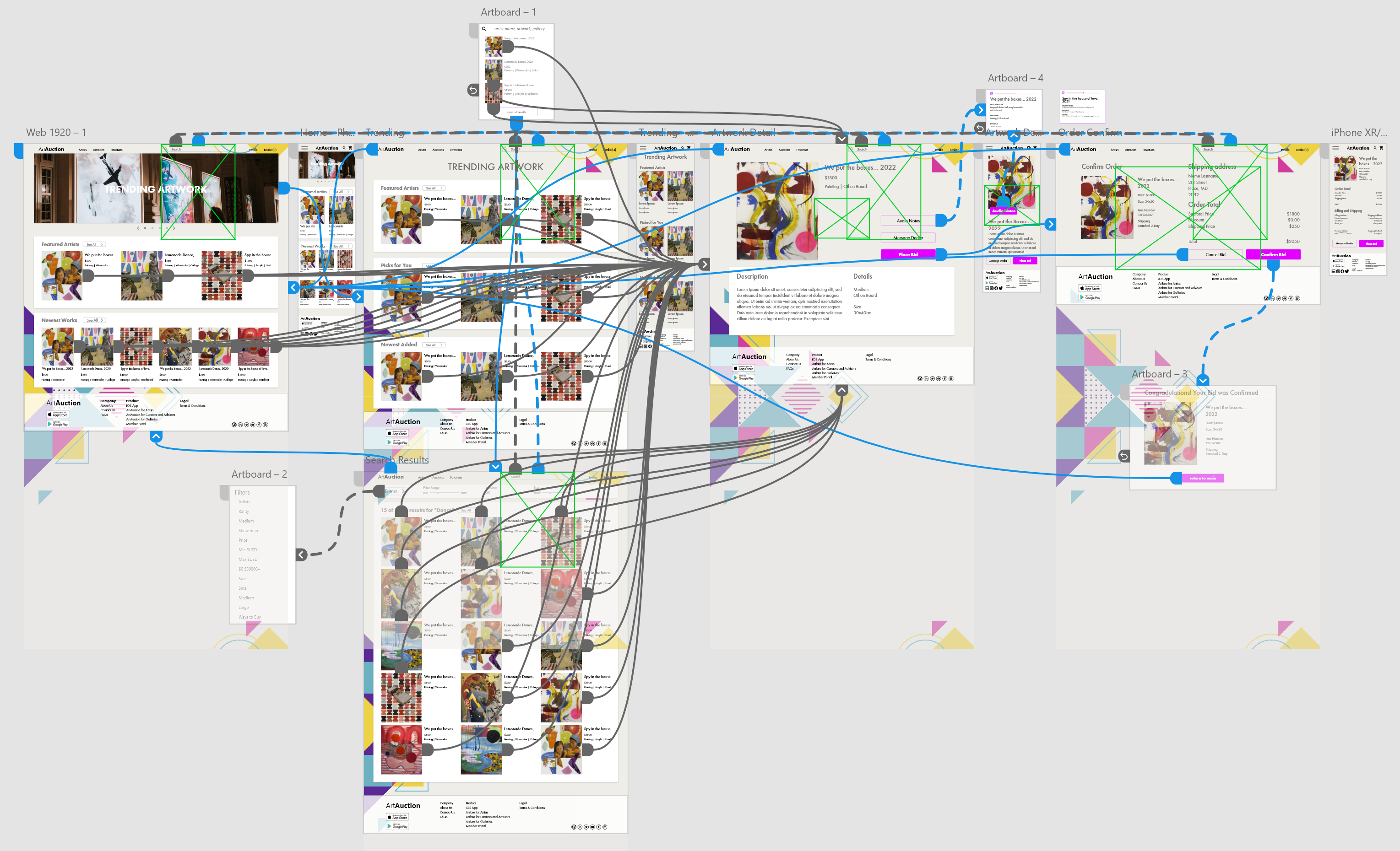
Digital Wireframes
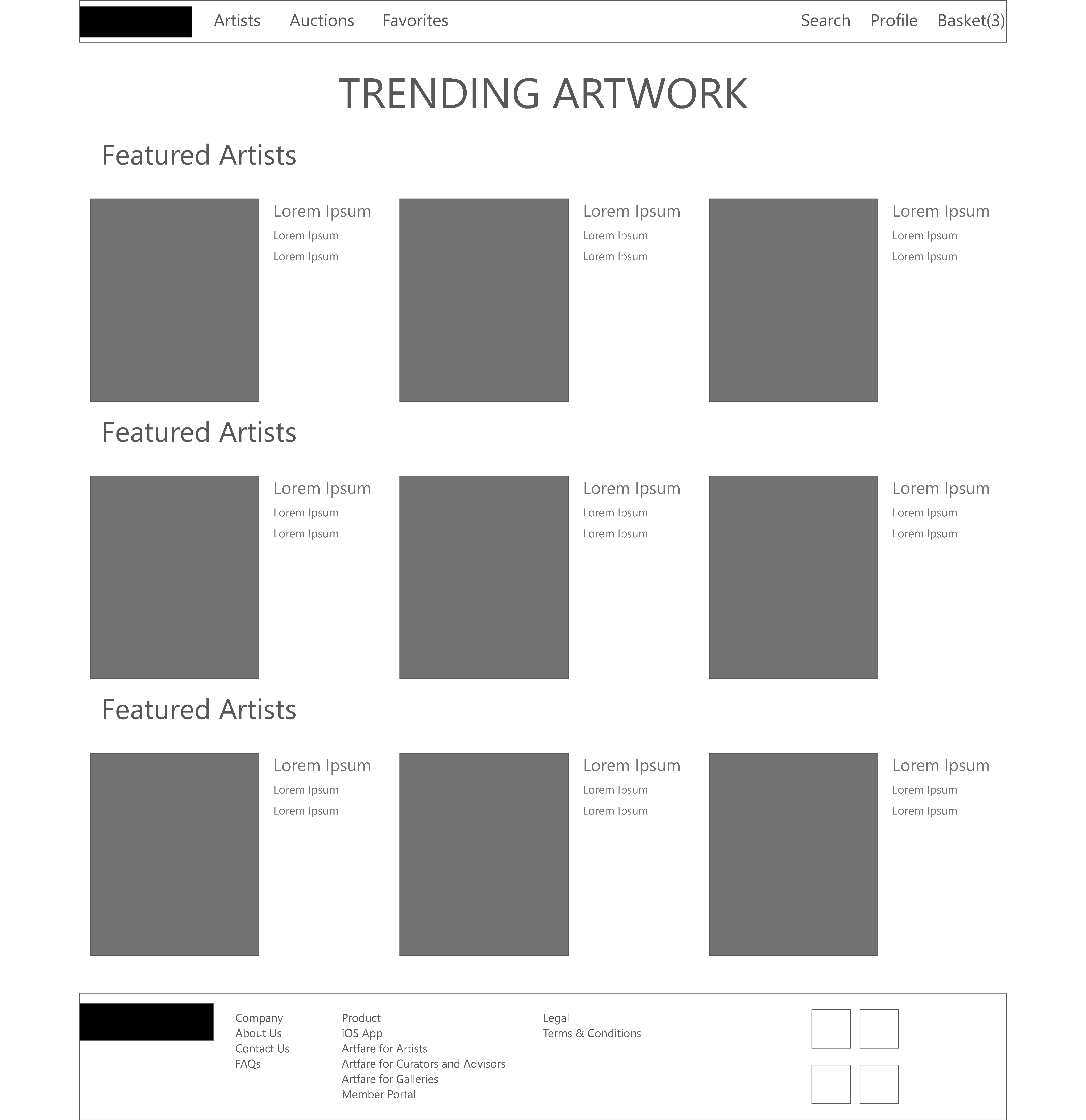
Taking the initial designs from the dedicated Art Auction App I was able to rapidly iterate on the wireframes to create a cohesive deisgn that would work for larger devices.
UI Overview
Based off of user feedback attention was taken to improve the UI organization and accessability considerations. I improved contrast to highlight key functions and add more focus to the active areas of the UI.
Challenge 1
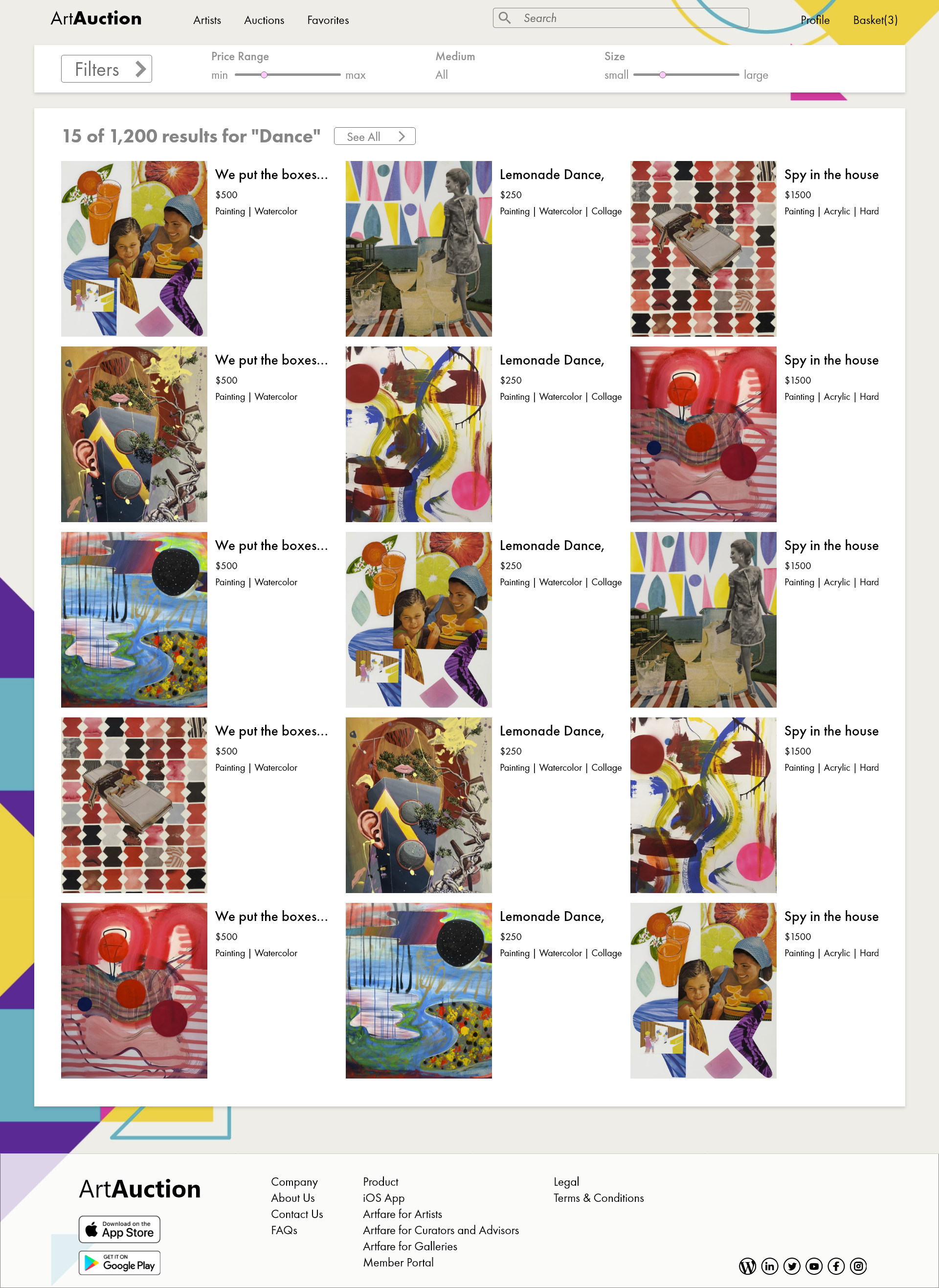
Search
Creating a usable search layout was one key focus. As there can be a vast number of results depending on what keywords are used there should be robust filtering optoins and good ways to quickly pair down results.
Challenge 2
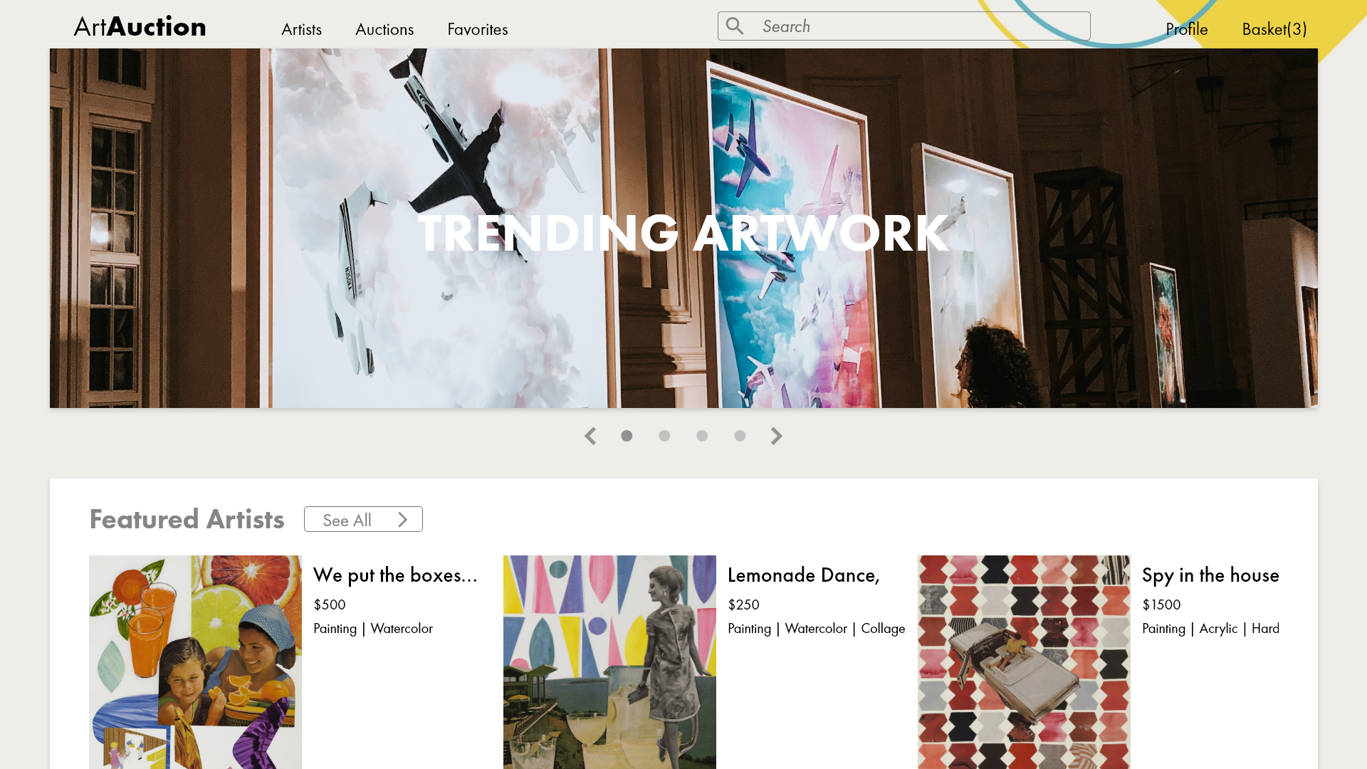
Homepage
Adjusted layout of main landing page slightly for better legibility and branding
Challenge 3
Formatting
Font sizes, layouts, and style guides all had to be modified to better suit larger screen sizes. The base architecture was maintained, but many improvements were made to allow for better legibility and layout design.
Wireflow
Built out Wireflow in Adobe XD to generate an interacitve prototye to test with users. Focus was given on how areas flow together with seamless navigation and IA.
Next Steps
Conduct another round of usability studies to focus on additonal features that may help complete the art discovery process
Refine and finalize the navigation style and visual design